The Histogram is not so grand: An intro to Histograms and CDF’s
Time to get into some descriptive statistics. You know all of those fun and wonky numbers and graphs that you always use but somewhere in the back of your mind your thinking, what does this really mean? Oh wait… is that only me?
To start off this topic I’m going to take a couple of posts and dive into histograms and CDF’s. CD what you say? Cumulative Distribution Function (which isn’t all that descriptive of a name for a descriptive graph) or CDF for those of use who realize that that’s way too many syllables for a name. I find a lot of people new to data science, geostatistics, etc. are usually familiar and somewhat comfortable with histograms or at least comfortable checking off that box that says, yep I plotted my histogram for my distribution, and confirmed that I have a histogram. However, there is a lot to learn from CDF’s, the nerdy cousin to the Histogram. Personally, although I use both, I tend to rely on the CDF’s more.
TL:DR
At their heart, both the histogram and the eCDF (empirical Cumulative Distribution Function) are displaying similar information, but in different ways. They are both trying to show how your variable is distributed across the range of your “distribution”.
Practically: The histogram bins your data and shows density by the height of the bar. The parameters used in creating the histogram can dramatically change the shape and look of the plot. The eCDF orders your data from least-to-greatest, and is really good at showing the probability that a value is less than, greater than, or within a range in your distribution. The eCDF has no parameters (such as size of bins) that will change the shape and look of the plot.
Mathematically: A histogram can be thought of as an empirical estimation of the Probability Density Function (PDF) and represents the probability with areas. Technically the PDF would represent this with an “area under the curve”. Histograms are bar plots… so I guess we can say they represent this with the area of a bar. The CDF is the integral of the PDF, is cumulative, and represents probability with vertical distances. The eCDF is the empirical estimation of the CDF. Unless you are dealing with a really large sample size, then you are not binning your eCDF and you there aren’t any parameters. If you are dealing with large amounts of data then binning the eCDF, with number of percentiles, MAY still affect things.
What’s a Histogram
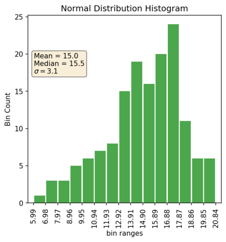
Histograms are one commonly used plot that gives a graphical representation of a distribution of numbers sampled from “something”. For us, that something is usually a natural phenomena such as gold grade. It is typically plotted in a bar graph style plot where the height of each bar shows the count of a bin, which in essence represents the probability that a number will fall within that bin.
Mathematically you can think of this as a slice of the area under a curve. The width of the bar represents the bin size used to group the numbers (or the width of the slice). The total width of all bars shows the range of values in the distribution. If you decrease the bin size infinitesimally you would get the PDF.
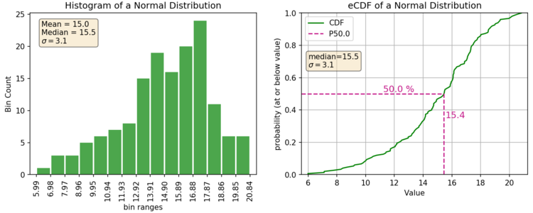
Here’s an example of your typical histogram:
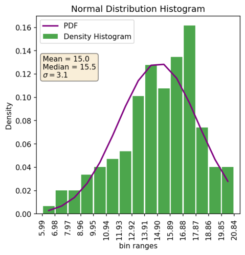
And here’s an example of a pdf style histogram (height of the bars equal density) and the estimated PDF of a normal distribution with the same mean and variance.
What’s a CDF
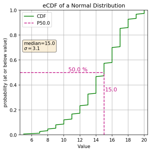
The cumulative distribution function (aka. CDF) is another graphical representation of the distribution of numbers (discrete, or continuous). With both the eCDF and the CDF, the y-axis represents the cumulative probability, aka the percentile of your distribution. The x-axis shows the values in your distribution (ordered from least to greatest). The actual eCDF line is using vertical distances to show the probabilities, and the slope shows how relatively quickly the values are changing. So if the slope is steep your values aren’t changing that much. If you have a shallow slope then your values are changing relatively quickly, in the example below that would be the head and tail of your distribution.
Here’s an example of the same normal distribution above but plotted as an eCDF.
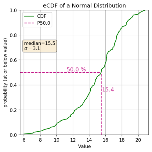
What do I mean by changing relatively quickly? Well looking above let’s look at a couple of sections. First 20% of our data, lying between the 0 and 0.2 quantiles, range from ~6 to ~11.9. Another 20% of our data, this time lying between the 0.2 and 0.4 quantiles, ranges from ~11.9 to ~13.8. They both represent the same portion of your dataset (20%) but the first has a larger spread with the values changing more rapidly, which can be quickly apparent by the markedly shallower slope of the eCDF.
The eCDF also works quite well for categorical distributions. Just be mindful of how the categories are related (ordinal or nominal). Here’s an example of the same normal distribution converted into a categorical distribution by converting all values to integers:
When do I use a CDF over a Histogram?
This question can lead down a very deep rabbit hole! Without getting too deep, I might save that for a later post after all, let’s look at some high level differences between the two. First off, they both are just graphical representations of one variable of your data, and they both have their own pros and cons and nuances towards properly using. Let’s first look at the histogram.

The histogram represents your data with area, i.e., the height and width of each bar. This can make seeing large overall shapes and spreads of your data easier to perceive. However there are the nuances of making sure the bin sizes don’t hide important information. Additionally if you are comparing datasets, for instance if you just randomly decided to say compare your drill hole grades versus estimated block values, then binning can really change your perception of how different or similar the two datasets are.
Alternatively, the eCDF represents your data with slopes. Our eyes are much better at picking out changes in the slopes so sometimes it’s easier to see things like outliers in your dataset. Also since you are plotting a line instead of slices of areas then comparing two datasets, like the above hypothetical comparison of your raw drill hole grades to your estimated block grades, is much easier and the nature of the eCDF makes it less likely to be affected by binning nuances.