Why is the first point of my variogram shitty?
TL;DR
Variograms are important tools for estimation and simulation and are in the core of geostatistics. They can cast a spell on you and voilà, you’re bound to them for eternity. You may have already noticed in your experimental variograms that the first point is usually shitty. It does not feel right even after hours and hours spent on fine tuning your variograms. If you’re also a lazy efficient person who understands that variograms are in their essence overfitted functions, then you may not care that much for that first wicked point in most of your variograms. For those haunted by it, this discussion may help you overcome your frustration and spare you from seeking therapy.
The first shitty point isn’t that bad, is it?
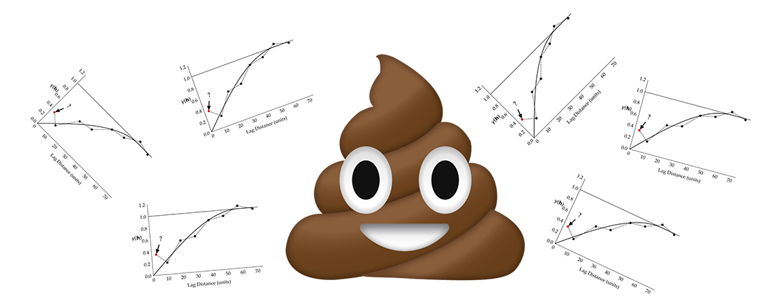
It’s not. Let me try to explain the first shitty point in a simple way, without jargons, because you know, the more you use fancy geostatistical and geological terms the more snobby you sound (reserve them for the right people and moment). You may have noticed in your experimental variograms $$\gamma(\mathbf{h})$$ that the first point is often not “aligned” with variogram points calculated on larger lag distances $$(\mathbf{h})$$. This point may appear above or below an imaginary possible fitted line that most of us can visualize in our minds when we look at experimental variogram points:
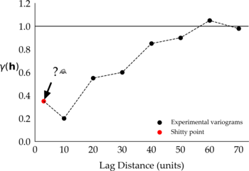
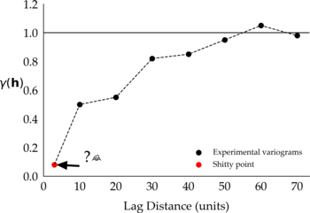
Figure 1: Two representations of the first shitty point in different experimental variograms.
If you want to fit a variogram model to these points and want to consider the first shitty point, then most likely you won’t get a good fit. You will have to consider fitting a model that (1) passes closer to the shitty point and away from the next subsequent points, (2) passes away from the shitty point and closer to the next points, or (3) passes in between the points in what you may consider an overall good fit. No matter which model you consider, the one shitty point has compromised the fitting of your variogram. Alternatively, consider fitting a model to the experimental variograms ignoring the shitty point, something like:
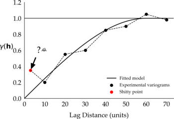
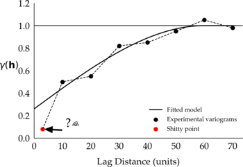
Figure 2: Proposed fitted model that ignores the shitty point.
You can tell that visually these variograms look good, and that the fitted models would have to change to accommodate the shitty points. If you decide to ignore the shitty point in your variogram, then be prepared to justify your decision. That involves understanding why the shitty point is there in the first place, how you could learn to live with it, or how to get rid of it (evil laugh).
Interesting, tell me more
The first shitty point in your variogram may exist because we miners are greedy. When planning a drilling campaign do you really care about drilling the low grade areas? Let alone the discussion on the amount of drilling that each area deserves, but if you said yes, then humanity may have a better future. If you only care about the high grade areas then you haven’t paid attention. Let’s just agree that in general there’s more drilling in high grade areas than in low grade areas. Also, in general, most mineral deposits have sparse areas of high grade and a lot of disseminated low grade. Translating to drilling configuration one can relate to the following figure
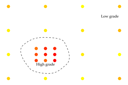
Note that because the first point(s) of the variogram are calculated with a small lag distance only the clustered data in the high grade area will be used in the calculations. And there enters the proportional effect . Yes the proportional effect that explains the shitty point like a boss:
Experimental variogram points calculated in short lag distances from high grade data points show more variability for two main reasons: a small number of pair data (N) in the variogram calculation $$\gamma≈1/N(\mathbf{h})$$ from sparse data sets and high variability associated with high grade data (the proportional effect). Similarly, variograms calculated from clustered data in low grade areas will show less variability (also, the proportional effect).

Holy moly, can I go drink now?
There’s more than the proportional effect. Let me try to clarify a few things. Data selection and transformations play an important role in your variograms. The volume or scale of data too. Trends, stationarity, outlier management, you name it, are all important factors that will have an impact on your variogram.
Waaaaaait a second there, Felipe. You went from “it’s the proportional effect, that’s all” to “it’s not only the proportional effect, it’s actually a whole bunch of stuff”. I don’t know if I trust you. What kind of clickbait post is this?.
Well, let me explain. If you work with geostatistics I’m 100% sure you’ve heard those terms before, and you know all that already. All I’m saying is that the proportional effect may likely explain why the first point of your variogram is shitty after you have carefully considered the best practices (something you find in every geostatistics book). There’s also a chance that the shitty point does not exist in your variogram, despite the proportional effect in the data. It also depends on the number of pair data that can be formed when calculating the variogram at each lag distance and how the transitioning between high and low grade areas is. I’m also assuming that these areas are sampled as they deserve.

A faster transitioning between these areas will likely cause more variability in the variogram points, causing points to be more “discontinuous” between lags. A slower transition may translate into variogram points showing a smooth transition from a lag to the next.
What should I do then?
Whatever it takes to get a good variogram! Really. The covariance matrix in the kriging system of equations is the engine that runs the beast, and the variogram controls the covariance matrix. A better variogram means more horsepower. But be fair. I might state the obvious here but I’ll try to help. The first thing to do is to check the number of pairs that are used to calculate each variogram point. From the previous examples that would be represented by the following figure
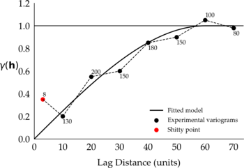
Figure 4: This figure is similar to Figure 2. The number on each variogram point represents the number of pairs used in the calculations.
This is something that most software will do for you. It’s likely that the first shitty point is calculated with a small number of pairs and more pairs can be formed in larger lag distances. The reason for that is quite simple. More points tend to fall within the search parameters of experimental variogram at larger lag distances:
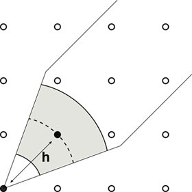
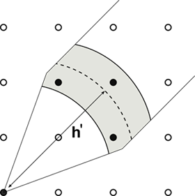
Figure 6: Representation of the variogram search for small lag distances (left) and larger lag distances (right).
Changing the search parameters may help. But that’s where fairness is important. For example, changing the azimuth and dip tolerances may be enough to get rid of the shitty point but there is a tradeoff. A large number of pairs $$N(\mathbf{h})$$ is good for reliability, the more pairs used to calculate a variogram point the more reliable that point is. On the other hand, a large number of pairs may cause a loss in directional anisotropy resolution. Sometimes only a few changes in the variogram search parameters are allowed. The choice of these parameters must agree with a reasonable geological interpretation. For example, in layered horizontal deposits the horizontal search bandwidth must be such that the anisotropy is captured and samples from subsequent layers are not “mixed” in the variogram calculation. In such cases, changes in the search parameter might not be enough to get rid of the shitty point. The same number of data pairs and the same composites will be used to calculate the experimental variogram at short distances:

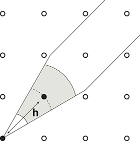
Figure 7: Experimental variograms calculated at short lag distances are less affected by changes in the variogram search parameters than larger distances.
If a stubborn shitty point remains after changes in the variogram calculation then consider removing the cluster data and recalculating the variograms. It’s simple like that. Having both variograms side-by-side might help you make the decision on which one to keep, or even give insight on the shitty point. You can also consider removing unusually high or low shitty first points from your experimental variograms and model the variogram without them. Another alternative is to use more robust functions such as the correlogram. Most of the time the first shitty point is not a big deal and there is a simple explanation to it. Giving too much importance to the first shitty point may lead to misinterpretations to your variogram. You may be inclined to fit a nugget effect that is too high or too low, or even consider adding another nested structure to your model. The shitty point is nothing but a shitty point. In our opinion, if you determine that the first point is shit because of one of the reasons discussed in this post, you shouldn’t give it too much importance. Remember, you want to aim for that gold medal and don’t get distracted with little things.