Histograms and eCDF’s: Practical Tips to reading them like a fourth grader

TL:DR
Looking back at our previous post, both the histogram and the eCDF (empirical Cumulative Distribution Function) display similar information, but in different ways. They are both trying to show how your variable is distributed across the range of your “distribution”.
The Histogram displays your sample distribution using areas (area under the curve, bars of binned data, etc) and shows the frequency of the variables within a small slice of your distribution. The eCDF displays your data in sequence showing the cumulative distribution of your variable and displays changes in your variable with changes in slope.
The Histogram shows you the spread of your data and the frequency of values within each bin. It can also be used to get an visual idea of the shape and skewness of your sample distribution. The eCDF shows the spread of your data and cumulative cutoffs, i.e. what values are at or below a certain percentile/quanitle. The slope of the eCDF also gives a good visual indication of how quickly values are changing throughout your distribution.
Tips for reading Histograms like a 4th grader
Ok so you probably already knew what a histogram was, and you might already know how to read a histogram, but to make sure we are on the same page let’s look at what the histogram shows us. We’ll take a normal distribution and plot its histogram and look at some different information we can glean from this plot.
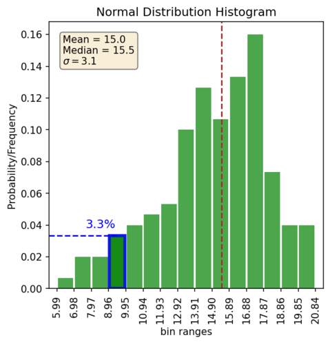
First, what are the main components of the histogram plot. The x-axis shows the actual values in your distribution. The y-axis shows the count/frequency/density (more about that later) of your data for a given bin range. The bars show the density of your data for each bin.
There are some general pieces of information we can see from the plot without plotting any annotation. These are: the range of values, frequency of a value within a bin, the general shape of the distribution, the skewness of the distribution, and possible outliers. So let’s look at those with the above plot:
| Range of values | 5.99 to 20.84 |
| Probability of value in 4th bin | ~3% |
| Shape of the distribution | Typical normal “bell curve” |
| Skewness | None |
| Outliers | None |
In the above table, we did say there wasn’t any skewness. How do we know that? Well some of it is based on our own loosy-goosy feeling of what the shape looks like. The other way we can get a quick sense is to also plot the mean and median lines and see if they look close together, or you could calculate Pearson’s first or second coefficient of skewness. By the way, plotting the mean and the median is a pretty powerful simple check.
This brings up another interesting point. You can’t really tell where the middle of your distribution is without plotting say the mean and the median, especially if you do have a skewed dataset (like maybe a gold resource anyone??). It’s a non-trivial problem to add up in our heads the probabilities of all the different bins and figure out which bin lies in the middle. Here it might look easy because we are dealing with a normal distribution. So when it makes sense it can be helpful to plot up some of those reference lines like the mean/median.
These tips help me produce better histogram plots of my own. Not that I don’t screw them up from time to time! So, now that we are on the same page, let’s look at some more advanced tips for reading histograms.
Paying attention to y-axis
I’ve kind of glossed over what exactly the height of the histogram bars mean. That’s because I’ve come across at least three different types of histograms in my trek down this rabbit hole. So always check that y-axis, and please for the love of God, label the axes of your plots. In fact just label your plots in general.
The three different values displayed on the y-axis that I typically see are either “count”, “frequency/percentage”, and “density”. Here’s an example of all three. Each of the three types of histograms looks very similar with the only difference being the values on the y-axis.
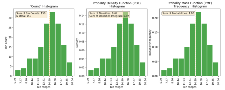
The count and probability/frequency types are pretty easy to understand and know what you are looking at. The count style is just illustrating the count of values in each bin. The Probability/Frequency style gives you the frequency or probability of the values within each bin, and is an empirical estimate of the probability mass function (PMF). The density style gives you the density under the curve and is an emperical estimate of the probability density function (PDF). What’s a PMF? Well honestly it’s like the PDF but different. What’s a PDF? Well the PDF is the model that the histogram is estimating. Why do I need to know all this? 🤷 you don’t so let’s continue.
WTF is a Density histogram
I often also see the “density” type of histogram. The “density” style is an empirical estimate of the probability density function (PDF), and is a little odd to understand. As a note of warning, if the axis aren’t labeled it’s impossible to tell it apart from the frequency style. Often they are the same, until they aren’t. So please, don’t forget to label your axis! Did I mention that already?!? So what does the density mean? Well, it’s the area of the bin (width times height) proportional to the frequency of that bin, aka ‘density’. So as long as you have equal width, then the density is the same as the frequency. If it’s not, then you have a gotcha, cause you’ll think it’s a frequency until you randomly decide to add up all the bins heights and spend an untold number of hours trying to figure out why they don’t add up to something close to 1. Why is this used? Who knows. Well besides the fact that it’s one of the default options on many plotting programs (even scipy/matplotlib in Python), it is supposed to correctly account for the times when you decide to use varying bin widths. And, if you were a “real” statistician you’d have no trouble understanding it. But who among us are “real” statisticians?
The “good” thing is, most people don’t really actually look at the values on the y-axis. They are typically just looking at the overall shape of the histogram and using humanity’s surprisingly amazing ability to wild-ass guess at things like “oh this range looks like it represents about half of the area”. The bad news is that if you actually look at the y-axis and are trying to accurately interpret the values, you are led down a month’s long rabbit hole that maybe ended (or just started!) at this post after countless hours of googling. The plus side of following that rabbit hole is that you might end up writing a blog post about it.
How do we read an eCDF’s
So we know what an eCDF is, let’s start looking at what sort of information one can glean from this graph. (If you’re going.. cdFu..what?? Then head on over here for a short summary of it)
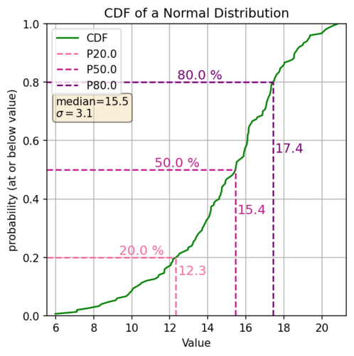
First of, what are the main components of the eCDF plot? The x-axis is the values in your distribution (ordered usually low to high). The y-axis is the probability of a value in your distribution being at or below that value. The slope of the line gives you an idea of the density of your data.
What are the general pieces of information we can see? The range of values, Percentiles (i.e. P20 is where 20% of the values are less than or equal to that value), Your median (because the median is the P50), anything related to the percentiles (i.e. what values are between the P20 and the P80, or what values lie within +/- 20% of the median). So looking at the above cdf to find the percentile we find the decimal percentile value on the Y axis (P20 = 0.2) draw a line horizontally over to our cdf line and then go straight down, that’s the percentile of our distribution. So let’s look at some of those values for the above plot:
| P20 | 12.3 |
| Median (P50) | 15.4 |
| Values between P20 - P80 | 12.3 to 17.4 |
| Probability of values between 11.6 and 17.2 | 80% - 20% = 60% |
The slope of an eCDF
What about the slope of the line? The slope of the line along the CDF also gives us some basic information. This in effect tells us how spread out values are. A steeper slope means that there is less spread (i.e. lots of similar values) and a shallower slope shows a greater relative spread in your data. So if we have a relatively shallow slope at the top or bottom that could be an indication of possible outliers. If you have a near vertical section, that’s an indication of lots of values of the same or nearly the same values.
Why not use both?
Double checking those default settings
These next two plots we’ll look at together to highlight some more tips. This also showcases some examples of why I often use both histograms and pdf’s together. If you’ve got em use em. Here I switch to a lognormal distribution which is pretty common in the natural resources world. This first plot shows a histogram using 15 bins, and an eCDF, you know, the snazzy cousin that just looks nice without even trying.

The plots look pretty normal. It’s definitely easier to tell with the histogram that we are dealing with a log normal distribution. And it’s probably easier to see some of the outliers in it. However let’s look at the next plot which uses 30 bins.

What? Yep so changing the number of bins definitely now changes how we look at that histogram. So let’s look at what we are seeing. Here I cooked up some data where I added a bunch of data points at a really low value, near zero, that would say represent a bunch of samples that were at or below the detection limit of whatever assay this distribution represents. With the wrong bin settings, you totally lose that in your histogram. However, if you also plot up the eCDF you would probably have noticed that nice little vertical section right at the start of the plot. Not blindly accepting the defaults on the histogram plot is also a good idea.
Finding those outliers
In some cases (like above) the outliers here are easier to see in the histogram, since the flat section at the end of the eCDF is a little hard to tell. The trick with the eCDF is to replot a zoomed in section at the tail with the individual points plotted. In fact, I use this trick way more than looking at the histogram even with the above dataset. Here’s an example:

What about that tail though? Is the sudden flattening of the eCDF really descriptive of your distribution, and where does it actually start flattening? OR is that an artifact of not having enough higher valued data to really understand what is going on in that part of your distribution? This is definitely an issue to be aware of if/when you start dealing with transformations / Gaussian geostats. That’s a topic for another post. So just be cognitive of the fact that we are always dealing with not enough data, we just have to know how to deal with that and where to deal with it. Understanding your data through these types of plots is the first step in that process.
Summary
Hopefully you have a little bit better understanding of what Histogram’s and eCDF’s can show you about your distribution. If you want to get a quick snapshot of your distribution to see what type of distribution you might be dealing with, a histogram is your best bet. But if you want to get a better grasp of the complexities of your distribution and what you are actually dealing with, I find myself flipping back and forth a lot between both the histogram and the eCDF. Unfortunately there is no silver bullet.
Note: Example Data
The main plots for this post are all based on the same randomly generated distribution of numbers created using Numpy’s random number generator in Python. To keep it to something most people are familiar with, the two distributions used are a normal distribution and a log normal distribution. I’m using a small number of data so my distribution is not “perfect” but much more realistic. If you want to see how I do this you can check out my example notebook ex_histograms_and_cdfs which shows all of the plots used in this post.
Further Reading
If you still haven’t travelled far enough down the rabbit hole, or you could just use a different way of explaining things, I’ve compiled a list of some of the sources I’ve found helpful in my own trek.
- This is a pretty decent free book going through statistics. Think Stats. Chapters 2, 3, & 4 deal with the Histogram, the PMF, and the CDF. Warning, a fair bit of it is showing how to do stats in Python, but if you aren’t into Python I still found the descriptions and examples helpful, just skip over the actual code.
- A good video explaining what an eCDF is and using it/creating it in python
- BBC’s Bitesize guide. Lots of good stuff here! The “data representation” series has a lot of useful information in 10 seconds or less
- Met office guidelines for using cdf and pdf. Surprisingly short and to the point!
- Free online textbook with nice pictures, and well… all the math. Chapter on PDF, Chapter on CDF