Are you googling PCA again?

TL;DR
If Google brought you here then allow me to say that the Lazy Modelling Crew (LMC) is a group of young geologists and mining engineers writing on this blog about Geostatistics and some of the techniques and methodologies that we use, almost, every day. And Principal Component Analysis (PCA) is one of them. If you are already subscribed to the blog and work with Geostatistics and multivariate modelling then this post is for you. As usual, I will be tackling PCA from a laid back perspective, rather than focusing on the numerical approach per se. By the end of this post I hope you will be more confident when choosing PCA for your analysis, and most important, to be able to communicate your choice effectively.
Am I addicted to googling PCA?
If you google PCA every once in a while, read what you found, use that information for 5 minutes, totally forget it after, and have to google it again the next time you need to know something about PCA, then YES, you are addicted to googling PCA. It’s not a big deal, though. You pay for your access to the internet and you can do whatever you want. But hey, I have a theory that might explain why you google PCA so much. PCA is so easy that your brain knows that it is not worth burning energy to keep that information, and it simply forgets it after. Thus, the next time you need PCA you google it again.
It turns out that you may not have access to the internet everywhere, or will not be able to reach out to your phone during a meeting, you forgot your favorite statistics book at home; or even worse, will need to say a few words about your experience with PCA to your boss or that consultant who has been working with PCA since before you were even born! And that’s when you need to know at least something about PCA by heart.
Spoiler alert!!! You will have to google PCA or open a book that time you have to run a PCA analysis for real. You will need to know the details and practical implementations about PCA, and that’s when you really need to google it! This post aims at clarifying a few things during the process of deciding if PCA fits or not in your project goals.
I will start with an example. Do not take it very seriously. I will try to do it without fancy figures or equations. There is more, I won’t dig up the equations on how the principal components are calculated because there are different methods to do that and most likely you will be using software with specific functionalities and limitations.
Learning with an example, why not?
Important notes about PCA are highlighted in bold.
It’s Friday and you and your friends are going to a party. You are a nerd who drinks and enjoys socializing (there’s something wrong here). Luckily you know everybody in the party and decide to run an experiment. You are interested in knowing what people are drinking. Your goal is to group your friends based on their favorite drinks, for this, you take notes during the party. They are serving vodka, rum, white wine, red wine, and beer. In this party people have that mentality of work hard and party harder, and most people are mixing alcohol.
From your PCA analysis you expect to identify groups of friends that are more into vodka and those who prefer red wine over white wine. This will help you decide on who you should invite for a little gathering if you only have one or two drinks available at home. From your notes you know that 100 people attended the party and were drinking at least one type of drink, and 80 people drank all types of drinks. You decide to organize your notes in a data table: people are the columns or the individual samples of your data, and the five rows of your table, one for each drink, are the variables measured for each sample. You drop the 20 people from your table and keep only the 80 people who had vodka, rum, both wines, and beer! Traditional PCA runs on equally sampled data. If you really must use all your data and do not want to exclude any information due to lack of observations, then consider running variations of PCA with missing data techniques. I will focus on traditional PCA.
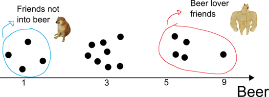
Perhaps the simplest analysis you can make is to look at drinks individually. For example, looking at the beer row, you note that a few people drank only one can of beer, whereas a large group of people drank three cans, and only a few people drank more than five cans of beer. One person stood out and drank nine cans of beer last night (the name is scratched out, but it was probably you). If you plot people’s names in a line ranging from 1 to 9 cans, you could easily group them into those who drink more or less beer (see illustration in Figure 1). This is a very simple analysis that can show who among your friends are more into beer, for example.
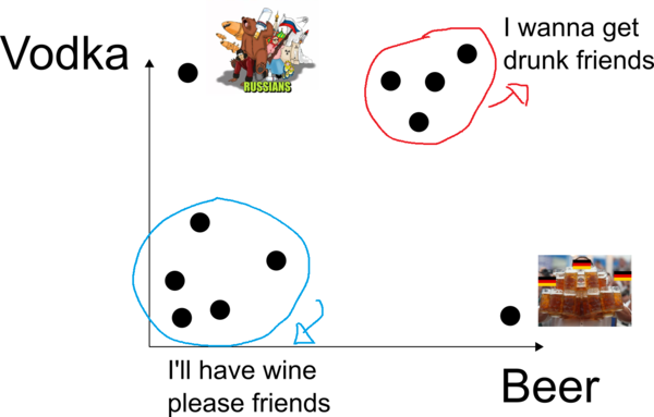
Consider now looking at beer and vodka. You notice from your notes that you have different measurements of alcohol. Your measurements are in cans of beer and shots of vodka. That is not a fair comparison to make since one can of beer does not have the same alcohol content of a shot of vodka. If you analyze one can of beer against one shot of vodka they might receive similar “attention” in PCA. Someone can drink up to 10 cans of beer in a party and be okay, but 5 shots of vodka might be the maximum some people can drink before passing out. A raw analysis on this data might lead you to conclude that people drink more beer than vodka. In PCA the scale of the measurements matter and you should consider standardizing your data first. I should also say that if variables are measured on the same scale and have approximately the same units then it might be fair in some situations to let variables with more variability contribute more.
After standardizing the data you get back to your analysis, you’re looking at beer and vodka. You now use a two dimensional graph, beer on the X-axis and vodka on the Y-axis (see illustration in Figure 2). The analysis remains simple and I bet you can cluster your friends based on their proximity in the graph. You may have friends that do not drink very much beer or vodka and would sit in the lower left part of the graph. Another group of friends drink a lot of beer intercalating shots of vodka between rounds of beer, they would sit in the upper right part of the graph.
The next step is obvious. You add a third drink to the analysis. With three variables you would look at a three dimensional graph. It’s starting to get difficult to group your friends together but you can still do it because you can still see in three dimensions! How about four dimensions? If you add both wines to the pool, how would you plot beer, vodka, white wine, and red wine together? Would you wake up the Carl Sagan inside you and instantly be able to visualize four dimensions? I’m sorry, I think not. That’s when PCA starts to show its power. It reduces the number of dimensions of the analysis so we can still look at them at two or three dimensions (any numbers of dimensions actually). PCA is in its essence a dimensionality reduction technique.
After applying PCA to your data you will be looking at the principal components (PC) and no longer at the variables. You will now be grouping your friends together based on the information the principal components provide. If you choose two or three PCs during your PCA analysis then you will be able to plot them in two or three dimensional graphics and do the same analysis you did before. You will also know from PCA which drink is the most valuable in each component for grouping your friends, so you know who you can expect to show up in that little gathering of yours if you tell your friends which drink you will serve.
Some jargons in PCA
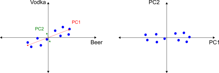
Let’s take a step back and review the two dimensional graph of beer and vodka. For illustration purposes, let’s work with the points in Figure 3. Let’s also assume that the points are shifted to the origin. Note that you’re not changing the relative position of each pair of data in the graph, you’re just centering the data at the origin so that the mean of the data is zero. Now consider a regression line that best fits the data and passes through the origin. There are many ways to calculate this line in PCA, and the methods are based on the nature of the data matrix, e.g., basic matrix operations if the matrix is squared (number of rows equal to the number of columns) or singular value decomposition (SVD) otherwise. Your software is likely to take care of that for you.
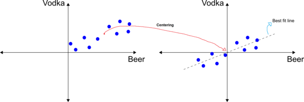
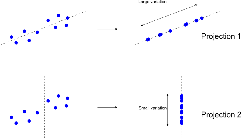
This best fit line is a “principal component”. PCA aims at reducing the dimensionality of your data while compressing the maximum amount of information onto the principal components. Principal component 1 is the component that holds the maximum amount of information, that is, it is the line with the maximum variation of the projected data. This line is shown as Projection 1 in Figure 4. Every other line will have a smaller variation than Projection 1.
The PCA transformation consists of projecting the data onto these calculated lines, and replacing the data value with the projected coordinate value. A PCA transformation is a rotation and/or stretching, and is achieved by eigenvector(s); you can think of the eigenvector as the vector that points in the direction of maximum variation (information) of the data. The length (or magnitude) of this vector is called the eigenvalue of PC1. Think of the eigenvalue as the spread of the data points onto a principal component axis, or the variation of the data onto that vector. The eigenvalues are what we use to compare and calculate the importance of each principal component for explaining the total variance of the data. At this point, any software will calculate and report the eigenvalues for PC1. Loading scores are another informative output of PCA; the Loading Scores are the scaled proportions of the linear combination of the variables and they tell you how much each variable contributes to each principal component. For example, the Loading Scores of 0.8 and 0.2 tell us that PC1 is composed of 0.8 parts of beer and 0.2 parts of vodka, that is, beer is 4x as important as vodka in PC1.
Here is something important about PCA: the assumptions underlying PCA are linear, that is, the method works better for linear relationships in the data. PCA aims at reducing the number of dimensions with significant importance. At most times, two or three components might be enough to explain a big chunk of the variance. If your data is non-linear, PCA is likely to generate more principal components with a significant importance in the analysis, thus not being able to reduce the dimensions of the problem.
And the other components?
Calculating PC1 is perhaps the most important step in PCA since other components are simply orthogonal vectors to PC1, see Figure 5. It’s a good practice to plot the pairs of principal components and analyze them separately. In the example given, the principal component 1 is calculated from the relationship between beer and vodka. In fact PCA will take care of that for you. Through the process PCA will find the vector that explains the most of the variability and calculate all the other orthogonal components – one for each component chosen in the analysis. The eigenvalues will be presented to you sorted by their importance, thus PC1 explains more of the variance than PC2, and so on.
An important tool in PCA analysis is the Scree Plot. In the X-axis of a Scree Plot we have the number of components – something that you have to choose when running PCA, whereas in the Y-axis we have the percentage of variance explained by each component. It’s also common to plot in a secondary Y-axis with the cumulative value of the variance explained, see Figure 6 for an illustration of a Scree Plot. Note that 100% of the variance is explained by five components, and PC1 and PC2 account for 85% of the variance.
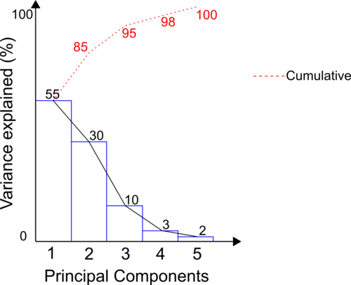
In the real world your PCA is unlikely to explain 100% of the variance of your dataset, there are non-linear and complex features in the data that contribute to this. The more components you add the more variance you explain. On the other hand you should question the practicality of a component that explains very little of the variance of your data. You should even question a component that explains 10% of the variance when PC1 explains 50% and PC2 explains 35%, for example. There’s more to it, the percentage explained by each component does not change if more components are added! In our example, PC1 explains 55% of the total variance with 5 components. If we run PCA with 3 components, PC1 would still explain 55% of the variance! There is no rule written in stone when it comes to choosing the number of components, but there are some guidelines and good practices. To choose the number of components start with the number of variables or samples (whichever is less). A rule of thumb is to pick the number of components that combined explain at least 80% of the total variance.
Let’s now analyze the results of PCA on our example. Let’s consider only two components, PC1 and PC2 since they explain 85% of the total variance of the party dataset. From the Loading Scores we know that beer and vodka have the most influence on PC1, whereas wine (red and white) are the most important variables in PC2. The PCA plot for the party example is shown in Figure 7.
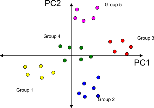
The first thing to notice is that grouping your friends seems easier now! Consider the five groups shown in different colours. These groups are spread out left/right and above/below the component axes. Note that groups 1, 4, and 3 are better distributed along the PC1 axis, and groups 2, 4, and 5 are spread out along the PC2 axis. Beer and vodka have the most influence on PC1 and thus are responsible for clustering your friends into groups 1, 4, and 5. If you serve only one of these drinks in your party you would likely see more people from groups 1 or 3, and some few random people from groups 2, 4, and 5. Similarly, you would use wine to explain the cluster of friends seen along the PC2 axis. Serving only wine in your party is likely to attract more people from group 5 or 2, and a few random people from the other groups.
There is one last thing about PCA I would like to mention. I could lay out another case of “responsible adults” where all data points are along the beer-only, vodka only and wine-only axes, for example. They have learned through many years of partying not to mix! In this case they already define the “principle components” since there is no mixing. Also, imagine a case where variables are uncorrelated (think giant random N-dimensional point cloud). Any axes you project the data will have the same variation and no “principal” components exist! With uncorrelated data, PCA will report approximately equal components. There is more; Principal components are mutually orthogonal, that is, uncorrelated, but not necessarily independent. This has huge impacts on the uses of PCA in multivariate geostatistical workflows that rely on or aim at decorrelation and independency. Another method Independent Component Analysis (ICA) is similar to PCA, where the aim is decorrelation and independence of the factors, but ICA deserves a post of its own.
Take Away
Here is a summary of what we covered and what I personally think anyone should know about PCA:
- Traditional PCA runs on equally sampled data.
- In PCA the scale of the measurements matter.
- PCA is a dimensionality reduction technique.
- Think of the eigenvector as the vector that points in the direction of maximum variation (information) of the data.
- Think of the eigenvalue as the spread of the data points onto a principal component axis, or the variation of the data onto that vector.
- The Loading Scores are the scaled proportions of the linear combination of the variables and they tell you how much each variable contributes to each principal component.
- The assumptions underlying PCA are linear, that is, the method works better for linear relationships in the data.
- Consider generating a Scree Plot in your analysis.
- The more components you add the more variance you explain. Question the practicality of components that explain very little of the variance of your data and consider dropping them.
- To choose the number of components start with the number of variables or samples (whichever is less). A rule of thumb is to pick the number of components that combined explain at least 80% of the total variance.
- With uncorrelated data with equal variance, PCA will report approximately equal components.
- Principal components are mutually orthogonal, that is, uncorrelated, but not necessarily independent.
I hope this post helped you fix some of the concepts of PCA so you only need to google it again when it is time to run your PCA analysis for real.
P.S.: there’s an abundance of PCA references out there and I think it would be unfair to cite some and forget others. You will be drowning in PCA material the moment Google sees “Principal C” …!