Creating Instagram Worthy Variograms

There are 3 key aspects to creating an instagram worthy variogram.
- you really do need to understand the geology and what you are trying to model.
- The better the experimental variogram is, the easier it is to model a reasonable variogram.
- Remember that you are modelling a variogram which is different from fitting data points, which is why variograms are still modelled and not just auto-fitted with the software.
Honestly, learning how to model a reasonable variogram is the hardest part of geostatistics, and the part that my brain rebelled against the most. Almost everything else about geostatistics is pretty straightforward and “logical,” from a data driven perspective, but modelling the variogram can seem more subjective than objective. Very rarely do we end up with nice textbook style variograms, because frankly nature and humans are messy.
For this post I’m just going to hit some high level tips covering the three main categories above. If it’s of interest, we might take some future posts to dive hardcore into some more specifics. So, let us know if you’d like to see more along that line!
Understanding the geology and your data
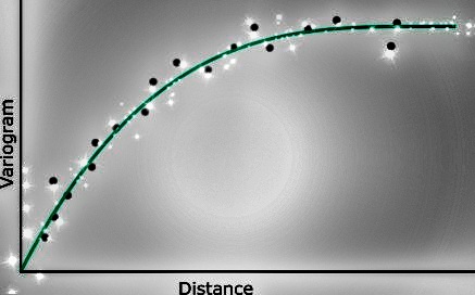
Let’s take a step back and think about what a variogram is from a geostatistical perspective. A variogram is simply a mathematical function that is trying to model, as best as we can, a geologic/spatially correlated variable for the purpose of estimating values in locations where we have no data [link to intro post]. At the end of the day we are taking incomplete, sparse, biased, messy, human collected data and trying to model a naturally messy and complicated system. Should be super easy and straightforward right! With that in mind let us jump into some tips
Calculate and model the variogram for the data you will be using.
Our data is messy, we are messy, geology is messy. Clean up what you can, deal with blanks, below detection limit values, capping, compositing, transformations, etc. etc. etc.. Then calculate and model the variogram for the data set that will be going into your model. The data shouldn’t change from the point you use it to model your variogram to the point you use it to estimate/simulate your blockmodel.
Make sure the variogram makes sense
The variogram is a measure of geologic distance and continuity. The point is not to fit data points but to model the geologic continuity using the available data. It may sound like semantics but bare with me. If your data is exhaustive and unbiased then autofitting would be the way to go, but when is our data ever unbiased and/or exhaustive? Exhausted maybe, but hardly ever exhaustive. One aspect of this is that your major, minor, vertical directions of continuity should make sense. Ok, we’ve all been there when we are staring at the drill holes assays and thinking “WTF? The major direction of continuity is pointing…. Towards the beer fridge?” So, what do you do then? Well here are a few tricks I’ve used that have helped me.
Display your data by intensity not “location”.
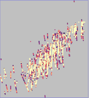
This is a little weird to say but easy to see. (I’ll try to show some photos) Some software allows you to display your overlapping data points based on highest values and not what’s “on top spatially,” AKA Maximum Intensity Projection. This allows you to “see through” the data and after squinting really hard you can pick how the high or low grade values are oriented. Second tip to go along with this. If you use a good color scheme like “viridis” or “magma” you will be able to see not only the highlights but the details and really be able to pick things out better. If you use a color scheme like “Jet,” we won’t be friends, and it’ll be really easy to pick out the highs, but at the loss of seeing the detail. (side note: if you are interested how color scheme affects your ability to see things, check out this video
Normal scatter plot view of data

Maximum Intensity Projection of data

Create a “smooth” model
You can use either global kriging or ordinary kriging (with a large search range, say ¼ the domain?) and an isotropic variogram model with a large nugget (at least 25-50% of the variance). What we are doing here is creating an overly smooth model that is data driven and, by filling in the blanks between our data points, can make it easier for us to pick out our directions of continuity. This often is enough for me to pick out the major/minor directions of continuity just by looking at the model in 3D, spinning it around or taking some slices through my domain. If however you still have that nice warm fuzzy feeling, then you could continue and calculate a variogram map using this smoothed model. Just please don’t use the shotgun approach of creating a variogram map from your drill data. Why you ask? A variogram map created from the drill data alone is often messy and noisy, and rarely helpful. It can be easy to find a “major direction of continuity” only to later realize that direction correlates to an orientation where most of your drill holes just so happen to line up. In this case this major direction is likely data configuration dependent and has no real geologic sense to it, hence your variogram needs to “make sense”.
Setting up future self for success
Once you understand the geology and what you are expecting from the variogram you can start tweaking those parameters for getting the best possible experimental variogram. Ok, who am I kidding, give the same data to 3 different geostatisticians and you’ll probably get 5 different variograms. So maybe “best possible” is too strong of a term. Regardless though, things like what lag distance to use, how many lag distances to plot, bandwidth and angle tolerances, etc. all will help set up future you for variogram modelling success.
The short scale is the most important part of your variogram
Remember that post where we talked about that first shitty point and to ignore it… well now I’m telling you that region is also the most important part of your variogram. For example lets think about estimating with ordinary kriging. The farther away you get from data points, the more the estimate is determined by the local mean then by the variogram. It is at the short ranges that the variogram really shines. If you have 10 assays all close to 3 meters away, which of those 10 really drive the estimate? That depends on where they are spatially. On the opposite end, if your nearest samples are all over 30 meters away and that’s the max range of your variogram, then your estimate is approaching the mean of whatever is in it’s range. If you make the range a little long, well you will add a few more points into your estimate, but the mean probably won’t change a lot.
The nugget effect is isotropic
Lock this in by using your best informed direction (i.e. often this is the vertical direction or your downhole variogram). If you overstate your nugget effect, your estimates will approach the mean. Most autofitting algorithms I’ve seen almost always overstate the nugget effect, so keep that in mind.
Tolerances are a necessary evil
We never have data that are perfectly lined up with the three directions of continuity we model variograms along. Therefore, we always have to use direction/distance tolerances when we create our experimental variogram. As soon as you include tolerances you are grabbing data that introduces discontinuity in the experimental variogram along each direction This is more of an observation than a tip, but it will help you think a bit more about what is going on. If you open up those tolerances really wide (say an omnidirectional variogram?) then just think about what that’s doing. An omnidirectional variogram will have a max range in the major direction that’s too short, but then you’ll have too long of a range in your minor directions. Even if you don’t use an omnidirectional variogram, wide versus narrow tolerances can give you drastically different variograms.
Anything you do wrong makes the variogram look bad
Yeah, that’s a real downer, sorry. The flip side to this is that just because you get a “bad” variogram doesn’t mean the variogram should be bad. There are a lot of things from the start that work against you producing a good variogram. So keep tweaking away! Ok, that’s probably actually bad advice. If you get to the end of your rope, instead of just continuing to mess with those parameters go back to the beginning, and maybe have a chat with the field geologist… or, maybe go grab a few fortifying drinks first, then go chat with the field geologist.
Final thoughts
Calculating and modeling a variogram is as much exploratory data analysis as anything else. If you don’t have an idea of what to expect then you are only going to get an “ok” variogram if you happen to luck out. This also ties back to the point that your variogram really should make sense. Of course at some point on some project you will most likely get to the point where you have to throw in the towel and just do the best that you can do. Maybe you pull that ol’ trusty omni-directional variogram off the shelf, or you look at another close by domain that you “think” is pretty similar. At this point though, just realize that your final estimates should probably have lots of asterisks next to them.
Hope this helps! If you have any trusty tricks of your own for producing instagram worthy variograms leave a comment below. I’d love to hear what everyone does!