RGB All The Elements: Using Colour to Understand Multivariate Relationships

TL;DR
Visualizing how the multivariate relationships within our multi-element data represent the geological processes we observe is hard. Relating how LEDs vary each of their three RGB colour channel’s intensity to create a single colour is an interesting analogy. What if the three colours are actually three elements, and the colour they produce represents a geological process?!
Introduction to Multivariate Relationships
Analyzing samples using an analytical technique that measures multiple elements (such as ICP analysis) provides us with a geochemical dataset that contains anywhere from 30 to 60 elements, which in geostatistical nerd speak, is 30 to 60 dimensions. When evaluated all at once, this highly dimensional data allows us to identify the geochemical signature of geological processes that have affected the deposit we are studying. These signatures can represent alteration, mineralization, metamorphism, redox reactions, or lithologies. Unfortunately, they are almost always some mixture of all of the above 😬. While none of this is very groundbreaking, it can be hard to visualize how the multivariate relationships can represent a single geological process.
I’m not sure about you, but my monkey brain cannot visualize beyond 3-dimensions. So evaluating all of the elements together isn’t an easy task. Therefore, we typically select a few elements we believe to be important to our study and assess them together. While very useful, we leave valuable information contained within our multi-element datasets on the table, unused and forgotten. In effect, we focus on a few trees without seeing the entire forest.
RGB ALL THE THINGS!!!1
I was pimping out my home office with LED strips one day, as cool people do, and I started to think about how they work. Each LED node on the strip produces colour by mixing three colours: red, green, and blue (RGB). By varying each colour channel’s intensity in the LED, a single colour is produced that is easily recognized for what it is. We would never describe colour by pretentiously saying, “oh yes, the colour I observe is an even mixture of red and green light.” We say, “it’s yellow,” like any good 4-year-old. Then my big-monkey-brain one day made an interesting connection between this concept and multivariate geological data. What if instead, the three colours are three elements, and the colour they produce represents a geological process?!

So, again, as cool people do, I decided to explore this idea via a blog post, naively assuming people would be as excited by it as I am.
Full disclosure, this post doesn’t cover how you go about evaluating all dimensions within your dataset at once. Its purpose is to provide an analogy to potentially help understand how multivariate relationships represent a single geological process. That being said, We WILL cover multivariate exploratory data analysis (EDA) in 2021. That’s a Warren Black guarantee. Some would say that isn’t much of a guarantee, but I have the best of intentions! I swear! We’ll update this blurb with links to those posts once they happen.
RGB THE GEOLOGY
I’m using a cheesy made-up story to demonstrate this post’s main idea, explaining how the colours produced by LEDs relate to geology, so please forgive me.
Let’s say I went out and collected a bunch of evenly distributed lithological samples from an entire drillhole and logged where the contacts are. I had them assayed for three lithophile elements (Ca, Mo, K) and told some poor chap named Jimmy to figure out where the lithological contacts are based on the multi-element data alone. I’m not giving Jimmy any help because this is a test, and Jimmy will fail.
So Jimmy goes along and does what he thinks makes the most sense; he starts plotting the three elements at the same time. He’s using that fancy 3-D mining suite software that is all the rage right now, so that should make this easy. Anyways, Jimmy starts to fiddle with how he plots each element downhole, but he can’t figure it out. Does he scale the graph by a log-transform? What does a ratio of elements look like? What should the lower limit of each element be? Does he plot the downhole data with a moving window!??! Two elements are in percent, and the third is in ppm; how does he relate them? Can he add them together and plot that?
Frustrated, Jimmy starts to get distracted because he lacks focus and decides now is a good time to set-up his LED strips in his home office. While doing that, he thinks about his current geological predicament, and he wonders what would happen if he assigns each of the three elements to an RGB channel so he can look at the colour instead?! Inspired, Jimmy cracks open a python script and transforms the original data that is in ppm and percent, to a range of [0, 1] without changing the shape of the distribution:
import pandas as pd
from sklearn import preprocessing

# Load Data
data = pd.read_excel('./data.xlsx')
eles = ["Mo_ICP_ppm", "Ca_ICP_pct", "K_ICP_pct"]

# Transform data to [0, 1]
x = data[eles].values
scaler = preprocessing.MinMaxScaler()
x_scaled = scaler.fit_transform(x)
pltdat = pd.DataFrame(x_scaled, columns=eles)

# Generate RGB Strip data
rgb = pltdat.round(4).values.tolist()

With the data transformed, he can now assign the three elements to the separate RGB channels at random. Mo to the red channel, Ca to the green channel, and K to the blue channel. He then plots the data as an “LED strip:”
import numpy as np
import matplotlib as mpl
import matplotlib.pyplot as plt

# Define a plotting function
def palplot(pal, ax, aspect=5):
    n = len(pal)
    cmap = mpl.colors.ListedColormap(list(pal))
    ax.imshow(np.arange(n).reshape(1, n), cmap=cmap, interpolation="nearest")
    ax.set_xticklabels([])
    ax.set_yticklabels([])
    ax.set_aspect(aspect)
    ax.set_xlabel(r'Drillhole Depth $\rightarrow$')

# Plot "LED Strip"
fig, ax = plt.subplots(figsize=(5, 1))
palplot(rgb, ax)
Cool, he can clearly see where the contacts are. My attempt to mess with Jimmy failed, sad.

That Was Easy, Now Do That Trick For Real.
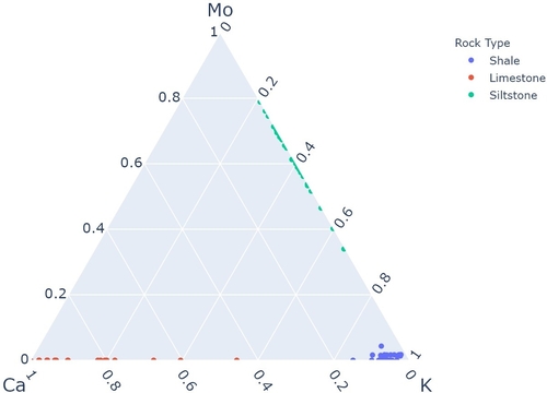
Actually, the data I used is totally real! There were three lithologies in the drillhole I used: shale, siltstone, limestone. I had a 41-element suite of ICP data that I paired with some fancy multivariate EDA techniques to figure out which three elements would make this example SUPER obvious. Here’s what those three elements look like on a ternary diagram:

Summary
In this thought experiment, looking at the three elements all at once is like shining three different coloured light sources at the same spot, in this case, red, green, and blue, as illustrated below.

In the middle, you get white, and around it, a bunch of colours that represent how each of the three light sources mix. In other words, a series of unrecognizable geochemical signatures. By assigning the three elements to the different RGB channels, instead of shining them as a single light source, we can calculate an RGB value for each sample. Evaluating each sample’s resulting colour allows us to identify the geochemical signatures we’re trying to find, as the colour represents a complicated multivariate relationship that we can easily visualize. Afterwhich, we can explain what each of the resulting colours represents geologically and know to look for it moving forward.